Freelance; Equilibria Branding and Website Art Direction
You can check out my resume right here.


With sweeping brushstrokes, this branding embodies the essence of Equilibria, a venture run by Chantal Riel. Riel offers both virtual and in-person yoga sessions, empowering people to connect with their inner selves. The soft, gentle hues of the water paint concept and look, along with the free-flowing typography, reflect the movements and suppleness of the human body.
This logo's fluid brushstroke design captures two abstract human forms, suggesting balance and fluidity. The use of watercolor paints in the logo creates an allusion to two of the essential elements of our planet: water and earth. The combination of these elements signifies the natural essence and vitality of the company's products and services.
The logo was created with vector art in Illustrator, while the business card design was crafted in InDesign, ensuring that both the logo and business card are of the highest quality. As a part of this project, art direction for Riel's website was also provided, ensuring that the visual design embodied the calmness and serenity inherent in yoga.
More portfolio pieces
View all


Sold out
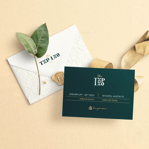
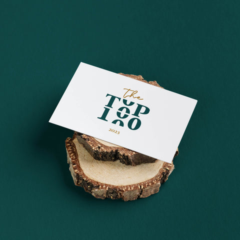
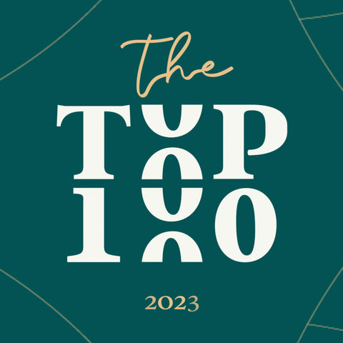
Shopify; Top100 2023 Event Branding